Behind the Booth
Art Show Booth Signage That Helps Visitors Find Their Way
Use a small, readable signage system to identify the artist, explain the work and guide visitors without turning the booth into a wall of text.
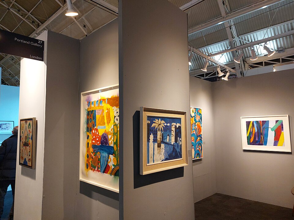
Good booth signage answers a few important questions at the moment a visitor needs them. It identifies the artist, explains how the display is organized and makes practical information easier to find. It does not have to narrate every work or compete with the art for attention.
Give every sign one primary purpose
Separate identity, orientation and detail. The main sign should make the artist or studio name visible from the aisle. Smaller signs can identify a series, explain a process, state a payment or shipping policy, or point to a portfolio. Combining all of that into one dense panel usually produces text that is too small to read.
Create a visual hierarchy
Use the largest type for the information that must work from the aisle, medium type for a visitor standing at the booth entrance and smaller type only where someone has chosen to stop. Keep fonts, colors and materials consistent so the signs feel like parts of one system.
Contrast matters more than decoration. Pale lettering on a bright photograph, reflective acrylic under spotlights or script type at a distance can defeat the purpose. Test printed signs in the booth rather than judging them only on a laptop.
Place signs along the visitor’s natural path
Stand outside the booth and approach from both directions. The main identity may need to be visible above a crowd, but it should not violate event height rules or create a wind hazard. Process information belongs near the relevant work. Checkout, portfolio and mailing-list information should appear where those actions actually happen.
Keep the entry open. A banner stand, easel or sandwich board that narrows the aisle or blocks the first artwork can repel the traffic it was meant to attract. Review What Really Goes Into Setting Up an Art Show Booth for the physical sequence behind a functional layout.
Write for a moving reader
Use short, concrete language. A visitor may give an aisle sign two seconds, a process card ten seconds and a portfolio page more time. Lead with the useful fact instead of a greeting or slogan. Leave white space around text and avoid placing essential information at ankle height.
Make information accessible
Readable type, strong contrast and a clear path help many visitors, including people with low vision, limited mobility or attention divided by a crowded event. Do not require a QR code for information that should be immediately available; provide a visible alternative. Place signs where they can be read without reaching across fragile work.
Prepare for outdoor conditions
Use secure, weather-resistant supports and rounded corners. A sign that becomes a sail is dangerous. Bring clips, weights and a simple replacement for the most important information. Never attach signs in a way that weakens the tent frame or emergency access.
Test before opening
- Read the main sign from the aisle
- Check glare under booth lighting
- Approach from both directions
- Confirm that signs do not narrow the entrance
- Ask another person what they notice first
The strongest signage disappears into a smooth visit. It lets the work lead while quietly giving visitors the confidence to enter, understand and ask better questions. Pair the sign review with the pre-opening exhibitor checklist.